deviant art

Deviant Login Shop  Join deviantART for FREE Take the Tour
[x]
Download Image
JPG, 680×600
more ▶

More from ~cat-cat

Featured in Groups:

Details

March 15, 2004
97.8 KB
680×600
Thumb

Statistics

Comments: 12
Favourites: 21 [who?]

Views: 651 (0 today)
Downloads: 252 (0 today)
[x]
:iconcat-cat:
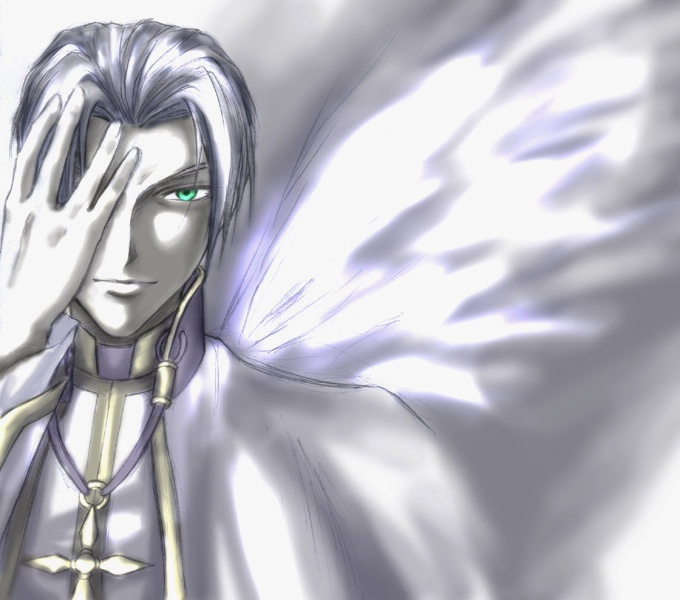
Done in pencil + Photoshop 5.0

The alternate version of the previous pic I've submitted with the same title.

Decide to submit this one as well because the more I look at this, the more I prefer this one over the other one.... x_x

(for info about the character and stuff, see the other version)
Add a Comment:
 
:iconelmara:
~Elmara Jul 3, 2004  Student Writer
*run out of words* Would a +fav suffice?
Reply
:icondeora:
~Deora Apr 3, 2004  Professional Photographer
This one reminds me of someone...though I can't think of who...Great wings ;) :+fav:
Reply
:iconnekoyumi:
PRETTY!!!!!!!!!!!!!!!
Reply
:iconwildcomets:
~wildcomets Mar 16, 2004  Professional Digital Artist
See previous comment...heh heh...

Anyway, the pic seem to suit both dark and bright tones, ya? Very nice. You can look at which ever one suits your mood at the time. :nod:
Reply
:icontalikira:
Ahhh!! THe blinding ness!! XO
Its so purdy.. Ahhhh it burns! @_o
Reply
:iconmandachan:
You brighten some area? (' x ')
Reply
:iconerithe:
*erithe Mar 15, 2004   General Artist
Ok, I definitely prefer this one. Wow. So pretty ... *claps her hands over her nose and runs to the rest room* Oh dear. .. and he's still got his shirt on!!!

*GRIN*

*Kidnaps the bish and runs off with him*


Anyway, I'm fascinated by his hand. I hate drawing hands, they always fight me. I love this version because the white emphasizes this sense of chill and brings focus to the drawn elements. As well as making his eye a lot more significant to the composition. Really well done :)
Reply
:iconerithe:
*erithe Mar 15, 2004   General Artist
There's a sense of power to this one that the other one doesn't quite capture. It's as though he's focusing on the viewer ... and, honestly, I'm not quite comfortable with the expression in his eye *Shiver* Dangeorus. :)
Reply
:iconkiplingskat:
Hmm, can't really do a side-by-side comparison, but this one seems a bit less angsty, probably cause it isn't as dark...o.o...AUGH!! Bad pun nooooooo! :ohmygod:
Anyways, I think the eye still stands out quite effectively. This one just has that washed out sort of blinding-light quality about it. :shrug:
they both be pretty, nonetheless. ^.~
Reply
:iconellaine:
~ellaine Mar 15, 2004  Hobbyist
Have no idea which one of the two I like more... They both have interesting colors. I like the lights here. Great job anyway^^
Reply
Add a Comment: