ShopDreamUp AI ArtDreamUp
Deviation Actions


Description
Again, I'm not sure if this actually qualifies as a tutorial... since I'm merely writing down some of the points I take into consideration when I ink. I hope some people would find what I'm about to say useful... 
---------------------------------------- ---------------------
About Lineart
If you have done some research into lineart done by the professionals/masters, you may noticed that their lines do not have the same thickness throughout the whole drawing. This is very important. The variation gives depth and sense of dimension to the drawing. A lineart that has variation definitely looks more interesting and not as flat as one that hasn't got any variation.
Of course, you don't just vary the thickness of the lines randomly. The thickness of lines can be use to represents a lot of different things, but most commonly - weight and depth. In the case of weight, thinner lines are use for lighter weight and vice versa. In the case of depth, thicker lines are use to "lift" up the object from the "back" .
This variation is not absolutely necessary, it totally depends on the look you want to achieve in your final piece. If you want a flat look, don't bother with this.
Inking on Paper
I personally cannot afford professional artist material, so I just used any random Fine Liners (the ones I use are Mitsubishi's Uni Pin Fine Line) I can find for my inking. Basically, any pens that can produce a solid black ink line (preferably water and fade proof) would be great for inking . DON'T use biro!!! They're good for writing but not for drawing. Back to the Fine Liners, it's a good idea to have various sizes, I believe they sometimes sell a pack that contains various different size too. The sizes I tend to use are 0.2, 0.3, 0.5 and 0.7. As to what size to use when you ink is totally up to you. I usually use 0.3 as my standard.
As for paper, I tend not to use sketch book paper (which are usually what we called "cartridge paper") when I do a drawing that's going to be CGed. The reason for that is the fact the surface of cartridge paper is not perfectly smooth. Well, it's smoother than sugar paper (what people usually use for charcoal drawing), but not as smooth as paper in photocopy machine. I found that this cause quite a bit of damage to the pen tips of my fine liners. Therefore I tend to use photocopy machine paper for the lineart of my CG pic. The down side is that these paper are not as durable as cartridge paper, so you have to be very careful when using your eraser to erase your pencil lines. DON'T use those fax machine paper with waxy surface, because they don't absorb ink very well, it's likely that you'll end up with a drawing with very smudgy lines. In general, you can pretty much draw on any paper you want, but if you want a clean lineart, I would suggest you use paper that has a smooth surface (you can use cartridge paper, that's not really a problem, but don't use pens that are extremely thin, because they will get worn out very quickly on cartridge paper).
Now onto drawing... when you draft out your drawing in pencil, you shouldn't be drawing too hard, otherwise you wouldn't be able to erase the pencil lines after inking and you won't get a nice clean lineart. It doesn't really matter whether you use pencil or mechanic pencil to do your sketch, I personally like mechanical pencil more because I'm used to using them. I suggest using grade HB or B for the job. I wouldn't suggest using anything higher than grade H or anything higher than B. It is true that the higher grade H pencils give "lighter" lines, but the pencils are also very "hard". So unless you draw very softly, I wouldn't suggest you using them. As for the higher grade B pencils, even if you draw very softly, they make dark lines that are difficult to erase. You should also get yourself a good quality eraser that can easily erase your pencil lines without leaving any dark smudges.
After you've done your sketch, it's time for the inking~ To be honest, there really isn't any easy method you can learn that will immediately enable you to do a nice clean lineart. I know a lot of people doesn't like to hear this, but practice is the only way to get there. The more you do it, the better you get. I can only offer some tips to point out some people's bad habbit:
- Sometimes people hold their pen too hard! The harder you grip, the harder it is for you to move freely, hence less control. As a result, it's likely that your lines would end up being wobbly and "stiff".
- With a pen, how hard or light you draw would not affect how dark or light your line would be, it only affect the thickness of your line. Therefore, you should only go over the pencil line you want to ink in a SINGLE stroke. You should not be going over a line and stop at half way, because it is likely that you wouldn't be able to continue from the point you stop at and still end up getting a single smooth line. Also, try not to go over a line you have already ink again, because it's very likely that you wouldn't be able to go over that same "path" perfectly.
With more practice, you should be able to get a feel on the curvature of your own pen stroke and what pressure would produce what thickness of lines etc. This is what you need, get the feel of your own pen stroke!!!
After inking, I would normally erase my pencil lines with an eraser, just be careful when you run your eraser over area with thick lines, since the ink would have "weaken" the structure of the paper there and if you rub too hard with your eraser, you may end up ripping your paper. If your pencil lines are relatively light in compare to your ink lines, then you can forget about rubbing them out with your eraser, since you can easily tune your picture in Photoshop and get those pencil lines out of the way.
Now onto scanning... The several scanners I've used before always offer several different scanning options e.g. Line Drawing, B&W drawing, Colour Photograph etc. I always scan with the "Colour Photograph" setting at 300 dpi (I wouldn't recommend anything lower than 150 unless your computer really couldn't handle it). I know that we're scanning a B&W lineart and the "Line Drawing"/"B&W Drawing" scanning option could probably scan in your drawing faster, but for the best quality, always go for the "Colour Photograph" setting. That's because I found those options always make your line extremely pixelate.
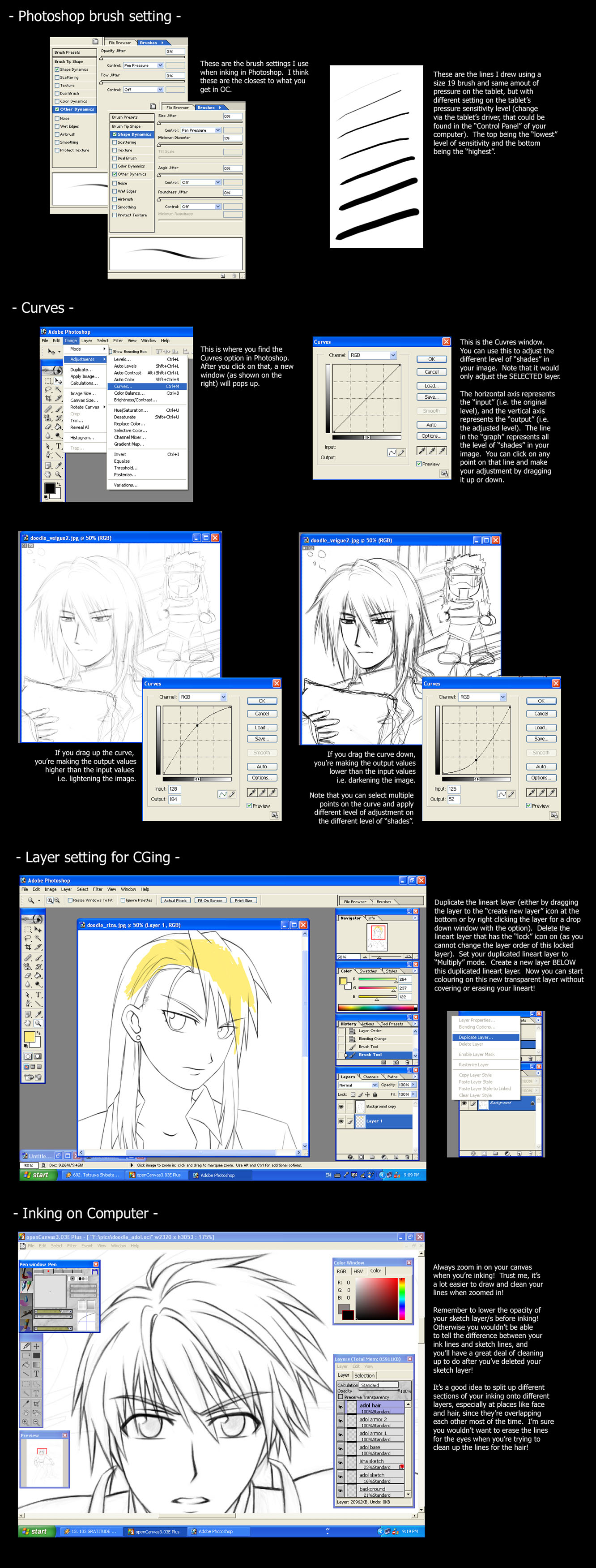
So you've got your drawing into program like Photoshop, time for a little adjustment. If you scan with the "Colour Photograph" setting, your lineart would not appear to be in perfect black and white, sometimes your ink lines may appear to have some strange yellowish colour border around them. To get rid of that, you'll need to turn your drawing into grayscale (in Photoshop - Image > Mode > Grayscale. If you decided you want to change the colour of your lineart, after Grayscale, you can go to Image > Mode > Duotone and mess around with the colours) After that, your lineart should be in perfect B&W. If you're going to be colouring your lineart, don't forget to change your image back into RGB format (Image > Mode > RGB Color) If you didn't rub out the pencil lines and they're still showing after scanning, you can adjust the contrast of your lineart by using the Curves (Image > Adjustments > Curves, see the image above for more info on Curves) or by using the Brightness/Contrast option (Image > Adjustments > Brightness/Contrast).
After doing all those adjustments, you can move onto colouring your lineart~
N.B. If you're scanning in your lineart, the "blank space" on your image does not appear as a transparent area and your lineart layer is locked as the background layer. Therefore you couldn't simply do what I did in my Cel-Shading tutorial, which is to have your lineart as the top layer and do your colouring on layers below your lineart layer. You can simply get around this by duplicating your lineart layer then delete your base layer (the one that has a lock next to the layer's name). After that, change the duplicate lineart layer to "Multiply" mode. Now you can add layers below your lineart and do all your colouring there without blocking out your lineart~ Note that if your lines are in a different colour (say red), this method is not suitable because the colour of your lines will get affected by the colours from the layers below.
EDIT: Apparently, by double clicking on the locked layer, a new window will pop up with settings for that layer, just click ok and it'll unlock the layer! Thanks to for the info!
Inking in Computer
If you do not have a tablet, you can "ink" your drawing in the computer with the "Pen tool" in Photoshop or Painter. As I'm not an expert in that field (I'm still having trouble in figuring out how to do it properly), it's not my place to teach people on how to do that...
Inking with tablet in a computer (using the traditional way) is pretty much the same as inking with a pen on a piece of paper. A major difference is that you don't have as much friction when drawing on tablet in compare to drawing on a piece of paper, therefore it might be a little bit difficult at the beginning. Again, my advice would be to practise on drawing in the computer with your tablet to get a feel on your own pen stroke.
I tend to ink my drawing in Open Canvas (OC) rather than Photoshop or Painter, that's because I found the default brush settings (in regards to the pressure sensitivity of the tablet) in OC are closer to what I want, also the settings are a lot more simpler and easier to understand (of course, this would mean that OC would not be able to achieve some of the things Photoshop or Painter could do) One thing I don't like about inking in Photoshop is that it doesn't support pan outside canvas (apparently this only applies to the versions before Photoshop CS) and also when you try to ink a line that's close to the edge of your canvas, your brush starts to behave wildly. As for Painter, I don't like inking in that because I couldn't work out all the complex settings there (yah I'm dumb). Anyway, if you don't have OC, then just ink with Photoshop, since after a bit of adjustment in the brush settings, you can get it to behave like the ones in OC. The setting I use is shown in the image above.
EDIT:It has been pointed out that this problem about the brush behaving wildly when close to the edge of canvas in Photoshop can actually be turned off! Just go to "View" and untick "Snap". Thanks to for the info!
So, you start off with a sketch (doesn't matter whether you scan it in or draw it directly on the computer). To make it easier to see whether your ink lines are nice and clean, I suggest you lower the opacity of your "sketch" layer (I suggest setting the opacity of the layer to around 20%). Add a new layer on TOP of the "sketch" layer and start inking. I suggest you zoom in when you ink, I just find it easier to draw smooth line and clean up your line when zoomed in. Since unlike inking on paper, you can erase your lines in computer when you've made a mistake, so it is not absolutely necessary that you draw out your ink line in a single stroke (this is extremely difficult when you're inking a long curve on the computer). Just that you'll probably have to use the eraser a lot for erasing the unwanted lines. Inking on the computer in this way is a tedious work, you'll have to be patient and cannot be lazy if you want good result! Personally I think it's a good idea to split your inking work onto several layers. I tend to have 1 layer for hair, 1 for body parts (e.g. face, hands, legs etc.), 1 layer for clothes and another for background (this is not absolute, you can always split it down to smaller sections). The reason for this is that it would be easier for you to make individual adjustments when needed (you wouldn't want to end up erasing half of the eyes because you're trying to smooth out the lines of the bangs)
When you're done, you can just simply merge your ink layers. Just remember to delete the "sketch" layer before you do the merging! Otherwise your sketch lines will be showing up as well as your ink lines! I also suggest you use "Merge Down" (Layer > Merge Down) rather than "Merge Visible" or "Flatten Image". That's because in the latter 2 options, your ink layer would be merged with a white layer rather than being on a transparent layer.
---------------------------------------- ---------------------
Phew~ That's about all I can say about inking... Cookies to those who manage to read through my entire essay and survive. My apologies for my sucky English grammar + any spelling mistakes. Blame it all on dyslexia!!!! *dies*
---------------------------------------- ---------------------
About Lineart
If you have done some research into lineart done by the professionals/masters, you may noticed that their lines do not have the same thickness throughout the whole drawing. This is very important. The variation gives depth and sense of dimension to the drawing. A lineart that has variation definitely looks more interesting and not as flat as one that hasn't got any variation.
Of course, you don't just vary the thickness of the lines randomly. The thickness of lines can be use to represents a lot of different things, but most commonly - weight and depth. In the case of weight, thinner lines are use for lighter weight and vice versa. In the case of depth, thicker lines are use to "lift" up the object from the "back" .
This variation is not absolutely necessary, it totally depends on the look you want to achieve in your final piece. If you want a flat look, don't bother with this.
Inking on Paper
I personally cannot afford professional artist material, so I just used any random Fine Liners (the ones I use are Mitsubishi's Uni Pin Fine Line) I can find for my inking. Basically, any pens that can produce a solid black ink line (preferably water and fade proof) would be great for inking . DON'T use biro!!! They're good for writing but not for drawing. Back to the Fine Liners, it's a good idea to have various sizes, I believe they sometimes sell a pack that contains various different size too. The sizes I tend to use are 0.2, 0.3, 0.5 and 0.7. As to what size to use when you ink is totally up to you. I usually use 0.3 as my standard.
As for paper, I tend not to use sketch book paper (which are usually what we called "cartridge paper") when I do a drawing that's going to be CGed. The reason for that is the fact the surface of cartridge paper is not perfectly smooth. Well, it's smoother than sugar paper (what people usually use for charcoal drawing), but not as smooth as paper in photocopy machine. I found that this cause quite a bit of damage to the pen tips of my fine liners. Therefore I tend to use photocopy machine paper for the lineart of my CG pic. The down side is that these paper are not as durable as cartridge paper, so you have to be very careful when using your eraser to erase your pencil lines. DON'T use those fax machine paper with waxy surface, because they don't absorb ink very well, it's likely that you'll end up with a drawing with very smudgy lines. In general, you can pretty much draw on any paper you want, but if you want a clean lineart, I would suggest you use paper that has a smooth surface (you can use cartridge paper, that's not really a problem, but don't use pens that are extremely thin, because they will get worn out very quickly on cartridge paper).
Now onto drawing... when you draft out your drawing in pencil, you shouldn't be drawing too hard, otherwise you wouldn't be able to erase the pencil lines after inking and you won't get a nice clean lineart. It doesn't really matter whether you use pencil or mechanic pencil to do your sketch, I personally like mechanical pencil more because I'm used to using them. I suggest using grade HB or B for the job. I wouldn't suggest using anything higher than grade H or anything higher than B. It is true that the higher grade H pencils give "lighter" lines, but the pencils are also very "hard". So unless you draw very softly, I wouldn't suggest you using them. As for the higher grade B pencils, even if you draw very softly, they make dark lines that are difficult to erase. You should also get yourself a good quality eraser that can easily erase your pencil lines without leaving any dark smudges.
After you've done your sketch, it's time for the inking~ To be honest, there really isn't any easy method you can learn that will immediately enable you to do a nice clean lineart. I know a lot of people doesn't like to hear this, but practice is the only way to get there. The more you do it, the better you get. I can only offer some tips to point out some people's bad habbit:
- Sometimes people hold their pen too hard! The harder you grip, the harder it is for you to move freely, hence less control. As a result, it's likely that your lines would end up being wobbly and "stiff".
- With a pen, how hard or light you draw would not affect how dark or light your line would be, it only affect the thickness of your line. Therefore, you should only go over the pencil line you want to ink in a SINGLE stroke. You should not be going over a line and stop at half way, because it is likely that you wouldn't be able to continue from the point you stop at and still end up getting a single smooth line. Also, try not to go over a line you have already ink again, because it's very likely that you wouldn't be able to go over that same "path" perfectly.
With more practice, you should be able to get a feel on the curvature of your own pen stroke and what pressure would produce what thickness of lines etc. This is what you need, get the feel of your own pen stroke!!!
After inking, I would normally erase my pencil lines with an eraser, just be careful when you run your eraser over area with thick lines, since the ink would have "weaken" the structure of the paper there and if you rub too hard with your eraser, you may end up ripping your paper. If your pencil lines are relatively light in compare to your ink lines, then you can forget about rubbing them out with your eraser, since you can easily tune your picture in Photoshop and get those pencil lines out of the way.
Now onto scanning... The several scanners I've used before always offer several different scanning options e.g. Line Drawing, B&W drawing, Colour Photograph etc. I always scan with the "Colour Photograph" setting at 300 dpi (I wouldn't recommend anything lower than 150 unless your computer really couldn't handle it). I know that we're scanning a B&W lineart and the "Line Drawing"/"B&W Drawing" scanning option could probably scan in your drawing faster, but for the best quality, always go for the "Colour Photograph" setting. That's because I found those options always make your line extremely pixelate.
So you've got your drawing into program like Photoshop, time for a little adjustment. If you scan with the "Colour Photograph" setting, your lineart would not appear to be in perfect black and white, sometimes your ink lines may appear to have some strange yellowish colour border around them. To get rid of that, you'll need to turn your drawing into grayscale (in Photoshop - Image > Mode > Grayscale. If you decided you want to change the colour of your lineart, after Grayscale, you can go to Image > Mode > Duotone and mess around with the colours) After that, your lineart should be in perfect B&W. If you're going to be colouring your lineart, don't forget to change your image back into RGB format (Image > Mode > RGB Color) If you didn't rub out the pencil lines and they're still showing after scanning, you can adjust the contrast of your lineart by using the Curves (Image > Adjustments > Curves, see the image above for more info on Curves) or by using the Brightness/Contrast option (Image > Adjustments > Brightness/Contrast).
After doing all those adjustments, you can move onto colouring your lineart~
N.B. If you're scanning in your lineart, the "blank space" on your image does not appear as a transparent area and your lineart layer is locked as the background layer. Therefore you couldn't simply do what I did in my Cel-Shading tutorial, which is to have your lineart as the top layer and do your colouring on layers below your lineart layer. You can simply get around this by duplicating your lineart layer then delete your base layer (the one that has a lock next to the layer's name). After that, change the duplicate lineart layer to "Multiply" mode. Now you can add layers below your lineart and do all your colouring there without blocking out your lineart~ Note that if your lines are in a different colour (say red), this method is not suitable because the colour of your lines will get affected by the colours from the layers below.
EDIT: Apparently, by double clicking on the locked layer, a new window will pop up with settings for that layer, just click ok and it'll unlock the layer! Thanks to
for the info!Inking in Computer
If you do not have a tablet, you can "ink" your drawing in the computer with the "Pen tool" in Photoshop or Painter. As I'm not an expert in that field (I'm still having trouble in figuring out how to do it properly), it's not my place to teach people on how to do that...
Inking with tablet in a computer (using the traditional way) is pretty much the same as inking with a pen on a piece of paper. A major difference is that you don't have as much friction when drawing on tablet in compare to drawing on a piece of paper, therefore it might be a little bit difficult at the beginning. Again, my advice would be to practise on drawing in the computer with your tablet to get a feel on your own pen stroke.
I tend to ink my drawing in Open Canvas (OC) rather than Photoshop or Painter, that's because I found the default brush settings (in regards to the pressure sensitivity of the tablet) in OC are closer to what I want, also the settings are a lot more simpler and easier to understand (of course, this would mean that OC would not be able to achieve some of the things Photoshop or Painter could do) One thing I don't like about inking in Photoshop is that it doesn't support pan outside canvas (apparently this only applies to the versions before Photoshop CS) and also when you try to ink a line that's close to the edge of your canvas, your brush starts to behave wildly. As for Painter, I don't like inking in that because I couldn't work out all the complex settings there (yah I'm dumb). Anyway, if you don't have OC, then just ink with Photoshop, since after a bit of adjustment in the brush settings, you can get it to behave like the ones in OC. The setting I use is shown in the image above.
EDIT:It has been pointed out that this problem about the brush behaving wildly when close to the edge of canvas in Photoshop can actually be turned off! Just go to "View" and untick "Snap". Thanks to
for the info!So, you start off with a sketch (doesn't matter whether you scan it in or draw it directly on the computer). To make it easier to see whether your ink lines are nice and clean, I suggest you lower the opacity of your "sketch" layer (I suggest setting the opacity of the layer to around 20%). Add a new layer on TOP of the "sketch" layer and start inking. I suggest you zoom in when you ink, I just find it easier to draw smooth line and clean up your line when zoomed in. Since unlike inking on paper, you can erase your lines in computer when you've made a mistake, so it is not absolutely necessary that you draw out your ink line in a single stroke (this is extremely difficult when you're inking a long curve on the computer). Just that you'll probably have to use the eraser a lot for erasing the unwanted lines. Inking on the computer in this way is a tedious work, you'll have to be patient and cannot be lazy if you want good result! Personally I think it's a good idea to split your inking work onto several layers. I tend to have 1 layer for hair, 1 for body parts (e.g. face, hands, legs etc.), 1 layer for clothes and another for background (this is not absolute, you can always split it down to smaller sections). The reason for this is that it would be easier for you to make individual adjustments when needed (you wouldn't want to end up erasing half of the eyes because you're trying to smooth out the lines of the bangs)
When you're done, you can just simply merge your ink layers. Just remember to delete the "sketch" layer before you do the merging! Otherwise your sketch lines will be showing up as well as your ink lines! I also suggest you use "Merge Down" (Layer > Merge Down) rather than "Merge Visible" or "Flatten Image". That's because in the latter 2 options, your ink layer would be merged with a white layer rather than being on a transparent layer.
---------------------------------------- ---------------------
Phew~ That's about all I can say about inking... Cookies to those who manage to read through my entire essay and survive. My apologies for my sucky English grammar + any spelling mistakes. Blame it all on dyslexia!!!! *dies*
Image size
1332x3500px 825.09 KB
© 2005 - 2024 cat-cat
Comments177
Join the community to add your comment. Already a deviant? Log In
I use biro pens and it comes out fine if you're careful while using them.